Saturday, November 7, 2015

Project Runway Season 14 Finale: Fashion Review

I'm going to begin this blog with a disclaimer: I do not regularly watch, nor have I ever even watched a full episode of, Project Runway. I've caught a few minutes here and there, but I've never watched long enough to get a feel for any of the designers or even for the way the show evaluates the designers' work. But I have written many fashion reviews of red carpet events that include some avant garde and haute couture styles, so although I have no claim to being a fashion expert, I know what I like and what works for me. So here is my take on the best and worst (or perhaps merely the least successful) looks that each designer presented in their final collections.

Swapnil Shinde

Best: I'm assuming, based on both the designer's name and his collection, that he is Indian. The influence of traditional Indian garb is clear in all his looks. I particularly loved this riff on the traditional sari. The flowing fabrics and lines in this outfit are graceful, the color is stunning, the metallic designs on the bodice are bold and distinctive, and the diamond-shaped panel is both modest and visually intriguing. The look is simple without being boring.

Worst: I didn't hate this look, but it certainly struck me as the least cohesive of the collection. The combination of leather, textured metallic, and soft chiffon fight each other instead of creating interesting contrasts, the slouchy cut of all three pieces makes them look poorly-fitted instead of being an intentionally casual design, and I simply can't imagine any occasion at which this look would be appropriate. Separately, the pieces are interesting and attractive, but the combination was too uneven and unbalanced, and just didn't work for me.

Merline Labissiere

Best: Labissiere's collection included several dresses based on this design, and I had a hard time choosing my favorite. But as striking as I found some of the color combinations, this monochromatic sleeveless version in rusty orange, with a high round neck, mid-calf hem, and generous pockets, paired with simple cream pumps and hat, continually drew my eye. I loved the slightly curved lines of the long front and back panels, the gentle gathering of the hip pockets which created a rounded silhouette without looking bulky, and the crisp, clean lines overall. This almost stark but still flattering and feminine look worked best at its simplest.

Worst: Interestingly, my least favorite of Labissiere's looks was very similar to the best: a monochromatic sleeveless dress with long panels front and back. But the sheath of this version was tight instead of skimming, featuring a stretchy fabric rather than a crisp one, which pulled the dress out of shape when the pockets were used, and the mid-hip length of the front panel was unflattering and drew attention to the misshapen silhouette created by the pockets. The raised neck with sharp front crease was interesting, but appeared to force the model to lift her chin uncomfortably. Perhaps a slightly lower collar or a slightly softer one would have been more successful. This wasn't a horrible look, but it had a few missed details.

Edmond Newton
Best: This IS Project Runway, after all, so we're not looking for looks that would be worn by ordinary mortals in our ordinary lives. So although I loved Newton's slim black halter gown, it didn't show anywhere near the creativity and uniqueness in this black and white number. By all rights, this dress should look stiff and bulky, yet somehow it looks light and flowing. I love the way the bow at the neck flows down the front and then circles the hem. It's not smooth and even, but it's just stiff and geometric enough to break up the simple lines of the dress and avoid looking like the piping on a wedding cake. The proportions are perfectly balanced, so the model doesn't look overwhelmed by the dress, but instead it looks like it moves gracefully as she walks. A great look. 

Worst: In direct contrast to the look above, the proportions of this hot mess are all wrong. The model looks like she's being eaten by the dress; the silhouette is top-heavy and uneven; the hem looks crooked but not enough to have been deliberately asymmetrical; the three layers are sort of the same length but not quite. This dress feels like it could have been a good avant garde look with a bit more precision and thought to proportions, but as executed, it looks too much like a satin trash bag held up with a few loops of duct tape.

Ashley Nell Tipton

Best: Okay, I had to cheat on this one because I simply couldn't decide which look I liked best. The embellished satin skirt with matching short bustier and coordinated chiffon overlay was just stunning. It's not easy to design a hugely full skirt (particularly for a full-figured model with hips!), never mind to add heavy appliques and three-dimensional detailing to a generous length of the hem, without creating a bottom-heavy or bulky silhouette. But somehow this skirt works. The chiffon overlay skims the hips beautifully, with a small amount of detailing on the hem echoing the skirt hem without competing with it. The neutral but not boring hues include just enough tiny pops of brightness to add visual interest without drawing the eye too much, and the contrast of shiny fabric in the skirt with the matte chiffon of the top (which also tones down the shine of the bustier underneath it) hits the perfect balance.

My other favorite look was this adorable lace shorts and jacket set. The black lace overlay on dark champagne fabric showed off the gorgeous texture of the lace and created a sweet peek-a-boo effect without actually being revealing. I loved the wide neckline of both the jacket and the mint green tee underneath. What I think I loved most of all, however, was the designer's bold choice to use a lace that created very distinct horizontal stripes. On a plus size model. Who looked FABULOUS in them. Who says you can't wear horizontal stripes if you're not super-skinny? Ashley Nell Tipton, that's who. 

Worst: Once again, "worst" is not as accurate a term as "least successful". This look was my least favorite not because I didn't like it, but because I couldn't quite figure out what it was supposed to be, or where the "designing" part came in. It's cute, but it's pretty much a long, unfitted tee with a v-neck and a slightly flared hem. The fabric is great, and as above, I love the bold use of horizontal stripes (and how the horizontal lace ties various pieces in the collection together), but the overall look of this piece is just too bland for my taste.

Kelly Dempsey
Best: Dempsey's collection had a decidedly 1960s flair to many of the pieces - some so much so that they could have stepped off a runway in 1965. I like this piece because it is clearly inspired by the 60s without being merely a copy of a vintage look. The silhouette of the dress, especially the flared bell sleeves, is very 1960s, but the illusion panels, the wide boat neckline, and the patterned silver inserts are all very contemporary. The subtle texturing of the silver panels adds visual interest without being too jarring, and the shine of the narrow brown bands ties together the beige illusion panels and the shiny metallics. This dress struck the best balance of every look in Dempsey's collection. Plus, it looks like it would be really fun to wear!

Worst: I confess that with only this photograph to go on, I may not have a clear picture of what this dress really looked like, but this is another case of enough minor details being missed to make the look not work well. The gold panels in the bodice look thrown together and poorly fitted, and the zippers (? or gold ribbon, hard to tell) in the front of the dress seem like a cute idea but look uneven as the model walks, and whatever undergarment is being worn under that skirt is causing both an unflattering hip bulge and an embarrassing impression (I really hope it's only an impression) of camel toe. The concept was fine; the execution fell flat.

Candice Cuoco
Best: I was somewhat underwhelmed by Cuoco's collection in general, but I did love the lace jacket in this look. The high collar, open front, and wide satin trim at the hem created sleek lines that were softened nicely by the rounded patterns in the lace and the swinging fullness in the jacket. It paired well with the sleek black satin leggings and the leather bustier, adding a touch of sweetness and softness to an otherwise very "tough girl" look. 

Worst: Again, Cuoco's "worst" look was more guilty of being bland and under-designed than of having an actual flaw. This gown simply has no personality, no visual appeal, nothing to distinguish it from any other look. The fabric is vaguely interesting, but even that is not highlighted by the design. It's just a...dress. With a slightly crooked hem.

Bottom line? If I were choosing a single favorite look, I think I might go with Dempsey's 60s-inspired tan and silver gogo dress. It's fun, it's wearable, it's unusual without being weird, and it's visually balanced. But in terms of an overall, unified collection of well-done pieces with essentially no misses, I have to go with Tipton. Every piece in her collection was wearable, flattering, coherent, and interesting. Not to mention that, being a sucker for hats, I loved - no, I ADORED - her use of huge floral hats to accent every one of her pieces and tie her collection together. They could easily have looked cartoonish or forced, but instead they connected every look beautifully into a coherent whole in a way that highlighted instead of distracting from each look.

After I finished writing this review, I looked up who the winner was, and it was no surprise to me that it was, in fact, Tipton. Her collection showed a cohesiveness and maturity that was lacking in some of the other designers, and I have no doubt that she will soon make quite a name for herself in the world of fashion design.

Hmmm, when does season 15 start? I might have to start watching this show regularly! I don't know how I'll fit it into my schedule, but I suppose I'll have to, in the words of Tim Gunn, "make it work."


Bookmark and Share

Thursday, November 5, 2015

The 2015 CMAs: Red Carpet Review

One of the many things that nearly all annual red carpet events have in common is that you tend to see many of the same faces, year after year. So let’s see how some of them have changed their red carpet style since last year! I’ll pull a few comments from the red carpet review I wrote for last year’s CMAs and compare them to this year, and then I’ll wrap it up with a few new folks who made the cut this year.

Carrie Underwood

In 2014, Underwood was several months pregnant, but managed that awkward stage very nicely in this flared gold lace frock with asymmetrical hem.


I’m not sure if she felt the pressure to show she’d gotten her figure back, but this year’s stunning peach gown with flared skirt, pleated peplum, and wide décolleté certainly proved that she has. The color works surprisingly well with her coloring, and the silhouette emphasizes her curves without looking like it’s working too hard. Elegant but sexy, this stunning gown puts Underwood solidly back on the best-dressed list where she belongs.

Kacey Musgraves

I was too busy being horrified at Musgraves’ horrific beehive ‘do last year to even notice her dress.


Wow, she more than made up for the hair AND the dress with her va-va-voom 2015 look. Channeling old Hollywood glam with her clingy bias-cut dark teal satin halter gown with cleavage to spare, softly waved hair, and pink lips against porcelain skin, Musgraves is all grown up this year. You go, girl! Er, woman.

Rachel Holder 

In 2014 Rachel Holder wore a lovely gown that unfortunately did not fit or flatter her as well as it could have.


She does not seem to have learned from her mistakes, because once again in 2015 she wore a beautiful gown that could have been much more flattering with a few minor alterations in fit. Tight instead of fitted, it wrinkles across the front and outlines the boning and the lining instead of skimming over her beautifully curvy figure. But the color is absolutely gorgeous on her, the more natural makeup and skin tone is much more flattering than 2014’s bronzer, and her necklace and earrings are sheer perfection. Not a completely perfect look, but she’s definitely moving in the right direction.

Kellie Pickler

I loved Kellie Pickler’s 2014 gown, with its studded detailing, rich fabric, and elegant lines. It was conservative yet unusual.


Pickler went in a very different direction this year, but her gown was still an eye-catching twist on a classic look. Deep royal purple satin with a fitted bodice flaring into a soft but structured skirt, a broad plunging V neck, only a wide silver cuff bracelet as an accessory, and simple hair and makeup resulted in a gorgeous clean and elegant look. Nicely done.


Last year there were several couples who worked well together on the red carpet.

Sadly, Miranda Lambert and Blake Shelton have divorced since the 2014 CMAs, when they appeared like this.

Shelton wore the classic “CMA tux” of dress shirt, suit jacket, and blue jeans, and Lambert wore a lovely and feminine Greek-inspired pale pink column.


If the best revenge is living well – and looking good – Lambert is definitely getting her revenge in her 2015 striking black column. Utterly simple, adorned only by a wide matte satin belt, long vertical stripe, and angled neck detail, it calls attention to her fun pink-tipped hair and sassy posture. I don’t love the hair drooping over her eye, but I can picture her flipping it rebelliously, so I’m giving her a pass.

Sorry, Blake, I missed you on the red carpet and your look on stage was boring. Step it up, dude.

Garth Brooks and Trisha Yearwood

In 2014, Yearwood and Brooks went classic but dull, she in a long, high-necked black gown, and he in his usual all-black suit and oversized hat.


In 2015, Brooks kicked it up a notch in an impeccable standard tux with satin shawl collar, and Yearwood brightened her look in an ecru textured column with simple silver necklace and clutch. I don’t love her slicked-back hair and overdone eye makeup, but she looks more alive and happy than last year, so I’m still putting them in the “improved” column.


In 2014, there were a few bands who caught my eye for their nicely unified look, their expression of individuality that was somehow tied together, or an effort to “clean up good” without losing their uniqueness. There were also a few who couldn’t quite figure how to present a unified front. Let’s see how each group has changed over the past year.

Lady Antebellum

In 2014, Lady Antebellum went with low-key, slim suits for the men and a tastefully clingy black gown for the lady, all in dark, subdued colors.


In 2015, they showed a bit more personality in the men’s choices of striped tie and fabulous open-necked black-and-white polka dot shirt and the lady’s print sundress with perfectly coordinated lipstick. Still elegant and classic, but showing a bit more personality and uniqueness. It’s a good change.

Little Big Town 

In 2014, Little Big Town was all over the map with different kinds of suits, different lengths of dresses, and very few coordinating touches.


In 2015, there’s still not a lot of color coordination, but the level of formality is a lot more uniform, and I feel like the band members (particularly the women) look a lot more at ease with their styles than the prior year. They look more like they’re wearing clothes and less like they’re wearing costumes. Plus, I kind of love the crazy black-lined flaps on the red dress. They work with the wild curly ‘do and the coordinated red smirk. And the guy on the right seems to be morphing into David Beckham, which is never a bad thing.

Fall Out Boy 

In 2014, Eli Young Band succeeded with the formula of black jacket and pants plus bright pops of color in personalized accessories.

In 2015, Fall Out Boy took that formula in a slightly more classic direction. Black dress pants and various styles of black tux jackets paired with personal choice of black or white shirt, tie or no tie, buttoned or not buttoned, and hat or no hat, resulted in a classy and unified but not uniform look. Not quite as much personality as Eli Young, but clean and classic.


And, finally, the men. In 2014, the men hit it out of the park. There were plenty of elegant classic looks and plenty of distinctive but not wacky looks. Did they do as well this year? Let’s see.

Dustin Lynch 

Once I was able to tear my eyes away from Lynch’s dazzling smile in 2014, I was impressed by his deep blue tux and crisp grey shirt.


In 2015, Lynch’s smile is just as dazzling, as is his grey-on-grey brocade, black-trimmed slim tuxedo, paired with a deep blue shirt, tie, and pocket square, and pristine black boots and ten-gallon hat. This cowboy still knows how to git along, little dogie.

Darius Rucker 

I was impressed by Rucker’s deep plum velvet tux jacket in 2014, which he paired with jeans and a white shirt and dark tie. 


I was even more impressed in 2015 by his cobalt blue silk suit with coordinating tie and pocket square and charcoal grey shirt. The jacket seemed the slightest bit tight across the chest, but the pants were perfectly tailored with just the right break, and I loved the bit of grey cuff peeking out from the jacket sleeves. Hoot hoot!


There were some notable looks worn by celebrities who didn’t make my list last year, so here are a few looks we may be revisiting next year.

Danielle Bradbery

I’m not always a fan of the trend of short skirts with long see-through overlays, but something about the angles of this one, along with the pretty lace edging and the dotted Swiss panels, appeals to me. Perhaps it’s the simplicity of the rest of the dress, with a plain round neck and princess seaming, but I like this look a lot.

Erika Christensen

I loved this dress a bit less when I saw Christensen moving in it, but for posed photos, the long draped ruffle added a graceful line to this off-one-shoulder flared gown in a bold electric blue. A lovely, feminine but not frothy silhouette.

Jewel

The CMAs are a great place to break out a casual short dress in lieu of a gown, and Jewel picks a perfect short frock: glittery silver fabric and coordinating strappy shoes and clutch, plunging neckline and sleeve cutouts with perfectly-camouflaged modesty panels, and picking a single facial feature to highlight with makeup (in this case, her eyes). Nicely balanced, not overdone, but subtly eye-catching.

Kimberly Perry

If I had calves like Kimberly Perry, I’d live in dresses (and 9-inch stilettos) just like this: A stark black clinging column with a round neck and a single long sleeve, with one side cut short and filled in with a panel full of polka-dot cutouts. Striking and sexy, Perry pairs it perfectly with straight sleek hair, minimal makeup, and impeccable posture. Wow.


And of course, what is a list of hits without a list of misses to counterbalance it? Here are a few folks who might need to step it up next year.

Jennifer Nettles
 
I really wanted to love this look. I felt like I should love this look. The woman is gorgeous. The dress is gorgeous. And yet somehow, they just don’t work together. I think that maybe the dress is more suited for a voluptuous figure than a slender one. Perhaps if the skirt rested lower on the hips instead of above the navel, or if the neck of the modesty panel were less obvious, it would have worked for me. Perhaps if I hadn’t seen it from the side, a view which made it look gappy and poorly-fitted. But I’d love to see Nettles put her amazing figure into something that suits her better next year.

Justin Timberlake

For the most part, Timberlake had good elements, they just didn’t work together. The short-waisted tux jacket didn’t work with the untucked white shirt, the untucked shirt was too casual for the buttoned-up collar, the cool suede boots were too fancy for the distressed jeans, and the not-a-hair-out-of-place coif was at the wrong awards show. Next year, I’d like to see Justin trade the white shirt for a softer colored open-necked shirt, downgrade the tux jacket to a textured suit jacket, and cover the hair with a cowboy hat the same shade as the suede boots. That would be a little bit country.

Lindsey Sterlin
 
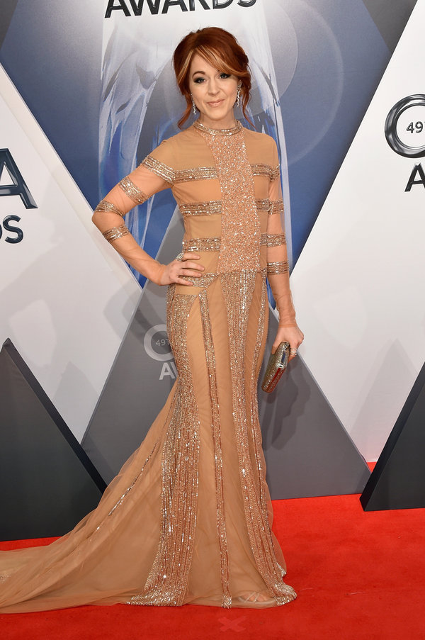
I don’t usually like dresses with different-colored tops and bottoms, but I think I’d have made an exception in order to fix this look. I love the skirt of Sterlin’s gown: it’s just the right amount of clingy, with a tiny puddle of hem and a small train, and sparkly vertical trim lengthening the lines of her legs. But the horizontal lines of the bodice, combined with the skin-toned shades near Sterlin’s face, do not flatter the way they should. I’d love to see a bright emerald, cobalt, or burgundy fitted corset bringing color and curves to the existing skirt.


Megan Linsey

Much like Rachel Holder’s gown this year, Megan Linsey’s gown had a great concept and an even greater color scheme, but the look fell apart because it was badly fitted. Linsey’s boobs are being squashed up and out, she looks like she can hardly walk or breathe, and her miserable expression says she is painfully aware of it. I love the color and spangle of the bodice and the coordinating hint of green in the velvet skirt; I love the hint of mermaid in both the colors and the silhouette; I love the asymmetrical platinum bob, the smoky eyes, and the pink lips. One size larger all around and Linsey would have looked like the beautiful bombshell that she is.


See you again at next year’s CMAs!!


Bookmark and Share

Tuesday, November 3, 2015

Mom's Favorite Kitchen Gadgets


I'm not exactly a gourmet cook, but I do enjoy cooking. Unfortunately, with two small children, I don't always have as much time to cook as I'd like. But there are a number of wonderful appliances and gadgets in my kitchen that make my culinary exploits a lot more manageable. Here are a few of my favorite kitchen items.

Crock Pot

The most obvious mom timesaver in my kitchen is my pretty red crock pot. It's big enough to make double batches that I can freeze for later, big enough to roast an entire chicken and make stock with the carcass, big enough for those soups and stews that magically come out much more voluminous than I intended. And the best part, of course, is that most recipes consist of dumping everything in around lunch time, then forgetting about it until it's time to eat supper. And did I mention that it's pretty and red, so it makes me happy every time I see it on the counter?

Keurig


Useful for so much more than just coffee or tea, I use my Keurig all the time to grab a quick shot of hot water - for making the kids a cup of cocoa or a bowl of oatmeal, for mixing up a batch of instant mashed potatoes, for melting the petrified remains of a forgotten lollipop in a car seat cup holder. Or even just to fill a mug with hot water to warm my hands.

Pizza Cutter


I know what you're thinking: "A pizza cutter? Seriously?!? How often do you eat pizza that it's that important to you?" Ah, but a pizza cutter works for so much more than just pizza! You can use it to cut up pancakes and waffles, you can use it to cut off sandwich crusts for picky eaters, you can use it to slice that gooey grilled cheese sandwich into "fingers" suitable for dipping into tomato soup. It's also an excellent Play-Doh toy. The uses are endless, really.

Waffle Iron

Although certainly not as varied in uses as a pizza cutter, the waffle iron has a useful function in that it makes things fancy. Do not discount the importance of making things look fancy in the eyes of a small child. Pancakes are nice, but when Mom or Dad makes waffles, the kids feel like they must be pretty special. Add some whipped cream and they're the Kings of the World. If you spend a little time on Pinterest, you can come up with a bunch of varied uses, from brownies to tater tots to cinnamon rolls, but even if you never make anything with your waffle maker except for waffles, it's still worth having.

Big Silicone Measuring Cup


I married into this baby, and now I don't know how I ever lived without it! First of all, it holds a full 4 cups, so I don't have to bother with filling my 2-cup glass measuring cup multiple times. Second, it's lightweight, so even when it's filled with 4 cups of water, it's not too heavy to lift with one hand. Third, it's flexible so you can grab it easily and squeeze the top to make whatever size pouring spout you need (ideal for making pancakes!). But as if that weren't enough, it's also deep enough to double as a mixing bowl that kids can stir in without splashing (also ideal for making pancakes), and it squeezes so little hands can hold it steady. The markings are dark and easy to read and don't come off in the dishwasher. Oh, and speaking of the dishwasher, since it's so flexible, you can wedge it into whatever space is left once you've filled the washer with all your other cooking tools. And, if your cabinets look like mine, you'll also find it handy that you can squash it into whatever space you have in the cabinet for storage.

Pie Slice Lifter

You probably don't think you need this sucker, but if you have EVER made a pie for company and been embarrassed by the disaster of serving that first slice, you need this. Tuck it in the pie plate before you put the crust down, and when you're ready to serve the pie, cut the first slice on either side of the visible edge. Then simply lift out that perfect slice - and it will be perfect! Even a slightly unset lemon meringue or pecan pie will come out neatly and cleanly. It doesn't even take up any room in your cabinets, because you can just leave it tucked inside the pie plate.

Dishwasher


It's not glamorous, but an automatic dishwasher is an even bigger timesaver than a crock pot. My beautiful LG washer barely requires rinsing of dishes, and holds an entire day's worth of dishes and silverware (and with my kids, drink cups alone can fill the top rack in less than a day)! I even put pots and pans, sharp knives, and the occasional wine glass in my washer, and they all come out perfectly. Much like the crock pot, I dump everything in, push a button, and come back hours later to find everything finished and ready to go.

Acrylic Wine Glasses


One of these wineglasses is crystal; one is acrylic. Can you tell the difference? I doubt it. But one of them can be dropped on the pool deck without fear of shards of glass meeting up with small feet. One of them can be used without fear to let a small person join a celebration and feel like a grown up. One of them costs 6 bucks a pop at Crate and Barrel (the other is 2 for $55 at Macys). Granted, one of them results in a disappointing "clunk" rather than a satisfying "clink" when toasting, but otherwise, acrylic glasses are convenient, inexpensive, and safe. (And in case you were wondering, the acrylic glass is the one on top.)

A Really Good Sharp Knife

About ten years ago, I hosted a Pampered Chef party, and splurged on a really good kitchen knife. This particular knife is a 10-inch Santoku that I use for EVERYTHING. It has a very keen edge (and is still plenty sharp after ten years of liberal use and many trips through the dishwasher), has just enough weight to it that it's easy to use, and the handle is perfectly balanced. It also came with a heavy plastic sheath so I can safely keep it in a drawer instead of trying to find a knife block with a large enough space for the wide blade. It makes slicing veggies a pleasure instead of a chore. 


So what's in YOUR kitchen that makes your culinary life easier and more fun?!??


Bookmark and Share

Sunday, November 1, 2015

"You Can Stop Talking Now"

I tend to have only two settings when it comes to talking: One click above silence, and verbal diarrhea. It's often very hard for me to start talking, but once I do, the floodgates open. Especially if it's something I feel passionate about or something I feel like I know a lot about. So anyone who asks me a question is likely to get either a shrug and a murmur, or a 15-minute discourse.

This isn't necessarily a bad thing. I do generally know enough to gauge my audience, and to try to get out more than a murmur when an actual answer is required. And most of the time I'm socially aware enough to shut up when my companions' eyes begin to glaze over.

But not with my kids.

For some reason, when my audience is my kids, I feel the need to repeat and rephrase things endlessly until I'm absolutely certain I've answered their question in every possible way, so that I can guarantee that they understand completely what I've been trying to tell them. But every now and then, they remind me that answers like that are not only unnecessary, they're often unwelcome.

This evening, for instance, my extremely bright 6-year-old (as of tomorrow) asked me, "Mom, why is there both a 'Disney' and a 'Disney/Pixar'?" Figuring this was a good opportunity to teach him a bit about how corporations work, I explained that Pixar was a company that made animated movies, but they started off as a tiny little studio that didn't have a lot of money or resources, but they did really cool stuff. So the big Disney company decided to buy them and use their huge amount of money and resources to help them do lots more big stuff (I left off the part about "and also make Disney lots more big profits"). Then I explained that Disney was like a really big circle, and inside that circle were a whole bunch of smaller circles, like Pixar, and Disney cruise lines, and Radio Disney, and Disney Junior TV. At that point, he interrupted me with a rather pained expression: "Mom! Mom! Little too much conversation! You can stop talking now."


Ouch.

And yet, good for him. He wasn't rude, he wasn't mean. He just let me know, in no uncertain terms, that I was overdoing it. And I need that little check every now and then. I tend to jump into parenting with a little too much enthusiasm sometimes, and I need a reminder that some things are better in smaller doses. Cake, for instance, is more enjoyable when you eat just one piece and save the rest for later instead of trying to stuff a whole entire cake down your gullet in one sitting. Dancing wildly is fun for a few minutes, but then you need to take a break and catch your breath. Putting on all your favorite clothes all at once is neither as comfortable nor as attractive as choosing a select few at a time. Watching an entire season of a TV series in one huge binge session can be fun in some ways, but you miss out on the savoring and speculating and mental analysis that comes with weeks between episodes. And information, going into small ears and small brains (sponges though they may be), is often best absorbed in small doses. In fact, the comparison to binge-watching an entire season of a TV series might be the best analogy. Children need to take in small amounts of information, and then take time to work those bits into everything else they know about the world. They need time to wrap their brains around all the implications of that new bit of knowledge. They need to let that new knowledge settle into their minds and finds its own place before they add more to it.

And I appreciate it when my kids are not afraid to remind me of that.

And that's all I needed to say, so I can stop talking now.


Bookmark and Share