Sunday, January 31, 2016

2016 SAG Awards: Red Carpet Review

I’m always looking for ways to freshen up my red carpet reviews, especially for new ways to present them and new categories to analyze. This year, I’m looking at the nominees in each female award category. (I did not list celebrities who were not in attendance or whose photos were not readily available online, and nominees in multiple categories only appear once.) I had planned on including the men, but it is nearly impossible to find online red carpet photos of them! Shame on you, media. Plus, I threw in a few additional folks at the end who seemed deserving of mention.

Outstanding Performance by a Female Actor in a Comedy Series


Uzo Aduba
Aduba’s pleated emerald gown was a stunning color for her, and its alternating stripes of plain and sequined fabric added visual interest and moved beautifully. Paired with a side-swept updo hairstyle, emerald and diamond earrings and ring, and an emerald clutch with red and gold accents, this was a terrific look. It looked even better when accessorized with her winning statuette.

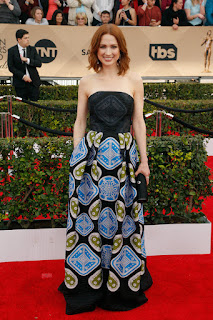
Elle Kemper

Kemper’s retro halter dress sported a black bodice and an oversized blue and olive diamond and circle pattern on the skirt, which was echoed in a black-on-black diamond on the bodice. It was a “cute” look, but a bit simple for her. I’m not quite sure what it was lacking, but it definitely needed something to liven it up – perhaps an electric blue shrug or shoulder wrap? Or a heavy statement necklace in blue or olive? She looks lovely, just not particularly memorable.

Julia Louis-Dreyfus

Louis-Dreyfus often wears black or black with another color on the red carpet, and this black-and-white frock was no exception. With just a hint of vintage in the 50s-esque silhouette and a charming black-and-diamond bow necklace, Louis-Dreyfus captivated without overdoing it. The dress was lovely at a distance, but closeup, what seemed to be black polka dots or random blobs appeared to in fact be leaves cascading graceful towards the hem, and the bottom 4 or 5 inches of the skirt were embroidered with a delicate white-on-white lacy floral pattern. The strappy black heels and simple black clutch were the perfect accessories.

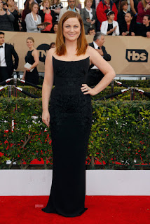
Amy Poehler

I’m not always a fan of stiff, structured bodices, but Poehler’s dress moved with her rather well. It didn’t have that stiff or uncomfortable look that boning can create. The broad, curved neckline was very flattering on her slim but straight figure, and her long, straight, newly pale auburn locks (fabulous color for her!) added to the elegant long lines of the gown. Continuing the trend of color-on-color embroidery, her gown had just a touch of black floral embroidery from the bodice down to the hips, giving just enough texture to avoid flatness. A very nice detail.

Fashion Winner: As much as I love Aduba’s look, I have to go with Julia Louis-Dreyfus for her classic, unfussy elegance, and just a bit of fun.

Outstanding Female Actor in a Supporting Role

Rooney Mara
Mara’s rail-thin figure is one of the few that can pull off such a stark, deep V-neck. With the simplicity of the dress, the severe hairstyle, and the unrelieved black, the look was a bit harsh. It needed a touch of softness somewhere – perhaps a short train, a single curl slipping from the ponytail, a pair of ruby or sapphire chandelier earrings, even a lavender or metallic clutch. Even a warm smile would have improved the look.

Rachel McAdams

Another gown with just a hint of vintage 50s, McAdams’ gown used black applique over a light brown base, with sheer shoulders and peekaboo sheer from the knees of the gown down. It was revealing without being revealing, very sexy yet very buttoned up. Her tousled beach-blond waves and youthful, pink-toned makeup were just the right touch to add some sweetness. Nicely done.

Helen Mirren

How is it that Helen Mirren continues to grow more and more beautiful over the years? The sparkling silver sheath fit her like a glove, showing off her voluptuous curves in a flattering but very age-appropriate way. The slight flare at the hem created a soft, graceful train, and the vertical lines of the beading emphasized that flare. The large diamond earrings peeking out from under her soft, platinum waves, and the matching diamond cuff, were exactly the right accessories. Simply stunning.

Alicia Vikander

I didn’t love Vikander’s gown when I first saw it, but it grew on me. I love the silhouette, I love the sequins, I like the various sizes of color blocks, but I think I just don’t like the colors, and I don’t like how the large gold and white panels at the neck bisected by the black stripe look like a bib. But it moved beautifully, and it seemed to suit its wearer well.

Kate Winslett

Winslett relies on a trumpet or mermaid silhouette, usually with cap sleeves and a plunging neckline, usually in a solid color, and this dress is no exception. However, the reason she relies on it is that it suits her beautifully, and that is certainly the case here. I like the peeps of satin at the edge of the neckline and sleeves, and I love the coordinating emerald jewelry and the little black clutch, along with the simple, sleek hair. Why mess with perfection?

Fashion Winner: Mirren, hands down. This look is pure elegance, and you can’t take your eyes off her.

Outstanding Performance by a Female Actor in a Television Movie or Miniseries

Nicole Kidman
I liked Kidman’s dress better up close than I did far away – the stripes seemed to soften and blend into each other a bit up close, but from farther away, they’re just awfully…stripy, for lack of a better word. The colors weren’t quite right for her, either, although the soft ruffles along the broad v-neck and along the hems of the skirt layers worked well on her tall frame, where they might have looked girlish on a more petite figure. She paired the gown with a beautiful long green necklace, which unfortunately clashed horribly with the gown. Hopefully that necklace will make another appearance, but next time with a gown that works better for both her and the necklace.

Queen Latifah

When I first saw Latifah’s dress, I thought it was fine – interesting pattern of spangles, black-on-black detailing (such a common theme of the evening), nice silhouette – but when I got a better look later in the evening, I saw that it swung gracefully and came to life with subtle sparkle as it moved. Accented by large drop earrings and an elaborately parted and coiled updo in light auburn, this look bumped up to a “well done” on my list.

Christina Ricci

Ricci’s pale lavender dress featured a fitted sleeveless lace bodice with pale turquoise and champagne-colored panels that cascaded into a full, pleated skirt. Paired with a chunky champagne clutch, a mix of silver, diamond, and amethyst bangles, and antique-looking drop earrings, with her long, straight, blond locks tucked behind one ear and smoky eye makeup with just a hint of a cat’s eye, her look was simple but sultry.

Susan Sarandon

There were parts of Sarandon’s outfit that I liked very much – the open line of the jacket lapels, and the wide legs of the trousers, even the pale gold clutch and matching slingbacks. But the bra. Oh, Susan, the bra. I didn’t even mind the peep of skin below it; the problem was that it was riding much, much too low. When your breasts aren’t as perky as they used to be, showing a non-demi-cup bra that is riding low enough to show that much cleavage is not a good idea. Raise that bra another two inches and it would have been a terrific look. But as it was, we were all staring at her cleavage, and not for the right reason.

Kristen Wiig

Wiig’s cropped black pants and cute sandals worked well for her. But her single-strap white top encrusted with…I’m not sure what those were. Tinfoil flowers? Crumpled paper snowflakes? Granny afghan squares? It just didn’t work for me. The detailing was too heavy on the one side and looked lopsided. Perhaps if it had gone all the way to the seam of the shoulder strap it would have worked for me, but as it was, it had an unfinished look. Wiig’s overall look just felt too casual for my taste.  

Fashion Winner: Ricci’s flowing lavender gown is a total win in any category.

Lifetime Achievement

Carol Burnett
Burnett gets a mention of her own merely because she is Carol Burnett, and she is awesome. As Amy Poehler and Tina Fey stated when they presented her with the Lifetime Achievement Award: “Carol is better than all of us. We’re gonna give her a prize for it.”
Burnett was wearing a gorgeous kelly green jacket and long, straight, slit skirt over a beautiful feather-patterned spangly black cami – and a pair of baby blue Ugg slippers. Lovely, talented, and smart.

Outstanding Performance by a Female Actor in a Drama Series

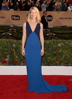
Clare Danes
Danes’ slender, willowy figure was perfectly suited to her clingy gown, with its plunging neckline, long narrow train, and blue and diamond jewelry. The lines of the darker blue panels of the bodice created a lovely, graceful silhouette. Its simplicity made it memorable.

Viola Davis

Davis’ striking dusky purple mermaid gown had a beautifully structured geometric tulip bodice that managed to look soft instead of stiff, but held its shape well and moved with her movements. The cinched-in waist, flared hem, and curved neckline with its double-layered narrow vee all combined to create a flattering silhouette. Add on softly waved hair, a heavy silver cuff bracelet, and a brilliant smile, and this look was as much of a winner as its wearer.

Julianna Marguiles

Marguiles also tends to fall back on a familiar red carpet style: a flat, bib, nearly halter-style bodice, a straight, narrow skirt, and some kind of simple detailing at the waist or neckline to add interest. It suits her slender figure and her perfect posture. This particular version is pure white, a lovely contrast to her jet black hair, with silver accents cinching in the waist. Simple, but elegant, requiring no accessories.

Fashion Winner: The could have gone to any of the contenders, but my eye keeps being drawn back to Davis, so I’m giving her the crown.

Outstanding Performance by a Female Actor in a Leading Role

Brie Larson
I loved the skirt of Larson’s gown – the double strap, the deep slit, especially the gathering over the left hip. But the asymmetrical slit in the bodice revealed an odd and unflattering view of cleavage, and made the entire bodice appear lopsided. Also, the strap in the back was a wide red canvas that looked like it came off of a backpack – what? The color of the gown was stunning, the silhouette was great for her curvy figure, and the details of fabulous shoes and a sleek, unfussy hairstyle were well-chosen. But the overall look fell just a hair short.

Saoirse Ronan

The silhouette of this gown was so simple and unadorned that it could have been boring. But the texture of the fabric and Ronan’s animation while wearing it made it work. The color, however, was much too pale for her, and a greater contrast with her natural skin tone would have been much more flattering.

Sarah Silverman

Silverman’s gown was an interesting style, but looked as if it had been very badly fitted. The bodice seemed loose and the fabric over one hip was baggy, yet she could hardly walk due to the tightness of the skirt. The concept was great; the execution fell very short.

Fashion Winner: I can’t bear to award this category to any of these gowns. I’m giving it to Helen Mirren again, since technically she was also a nominee in this category.  

Special Mentions
I’d like to end by recognizing two actresses who sometimes struggle with finding the right gown for an exceptionally voluptuous body, both of whom did exceptionally well in finding exactly the right gown for this event.

Christina Hendricks
Hendricks often lands on the “miss” side of my “hit or miss” breakdown – and I can’t blame her, because how hard must it be to dress this figure? In an effort to avoid looking trashy, she often ends up with a matronly look. But she is squarely on the “hit” side tonight. This fabulous strapless gold-on-gold brocade sheath is accented with a shoulder drape and a long train, and Hendricks accessorizes it with a fabulous crescent-shaped mirrored purse, long drop earrings, and a couple of diamond cuff bracelets. With her hair swept up into a wispy updo, smoky eyes, and soft pink lips, she walks that fine line between sweet and sultry. Kudos on a terrific look.

Sofia Vergara

Vergara may not be quite as buxom as Hendricks, but she also occasionally struggles with finding a gown that doesn’t look trashy or overly revealing. This stunning electric pink column is a miracle of technology, with the bodice heavily structured yet still hugging and moving with her body. I love the way the gown puddles just a tiny bit at the hem, and I love the stitching details at the top of the bodice. The chunky gold-and-silver statement necklace is just right as an accent, and the long, narrow proportion of her clutch is a nice geometric contrast to the curves of the bodice, even though it’s exactly the same color as the gown. Elegant, not trashy. Nicely done.

Jacob Tremblay
This young Best Supporting Actor nominee was so poised, both on the red carpet and in the audience, and so well-dressed to boot, that I feel the need to recognize him with his own award. In this fantastic pinstriped 3-piece tuxedo with crisp white shirt and perfectly hand-tied bow-tie and his hair perfectly coiffed, Tremblay held his sartorial own with all the gentlemen present.


Bookmark and Share

Saturday, January 30, 2016

Photo A Day: Flat Lay

I bet you had the same reaction that I did to the subject of today’s photo: “Flat lay? What on earth is a flat lay? Do I lie on my back and take a picture? Do I lie flat and take a photo at floor level? Do I squash something flat on a surface and take a photo of it?” You might be surprised to know that the latter guess is actually pretty close to being right. A quick check of the FatMumSlim blog where this photo challenge originated revealed that I was not the only participant stymied by today’s topic. Her simple explanation is, “A flat is basically when you’re shooting items from directly above. Usually these items will be arranged or styled on a flat surface.” She then posted a number of examples. If you’ve ever looked at a clothing catalog which doesn’t photograph their merchandise on models or mannequins, you’ve seen examples of a flat lay. All those “how to” recipe videos that have been all over Facebook lately? Take a screenshot of any of those and you’ve got yourself a flat lay.  

Which means that this is the rare subject that I can’t really get a candid shot of. I’ll actually have to get some stuff, try and compose it artistically, and then take a photo of it.

I can already tell this isn’t going to go well.

I began by wandering around the house to see if any objects inspired me. I started off on my husband’s bedside table. He empties his pockets there every night, so there are usually some interesting objects strewn around. I found a small pile of change, a few folded dollar bills, and a set of keys. Since gravity and chance had already arrange the change more artistically than I could have, I simply slid the bills and the keys into the frame and snapped a few shots. 


I didn’t realize until afterwards that there was also some pocket lint and a hair or two. Realism is good, right?

As I continued my wanderings, I came across an outfit my daughter had shed on her way to the dress-up box. I channeled my inner Baby Gap stylist and laid it out as artistically as I could on my living room floor. I added a hair bow in an attempt to make the headlessness less creepy. 


It didn’t work. This still looks as creepy as the headless mannequins in the window of Baby Gap. At least I didn’t put a baseball cap in there.

While I was setting up that flat lay, however, I spied our canvas bag of library books. Hey, books would be a good flat lay project! They didn’t look quite right in a random pile, so I decided to arrange them in a circle, with one of the smaller books at the center. 


It’s kind of cute, and it’s definitely a good representation of what my kids enjoy reading and doing, but the layout just didn’t end up as artistic as I’d hoped. On to the next random household objects!

On the other side of the room, our piano has some interesting knick knacks on it, including a candy dish whose contents – over a month after Christmas – are finally starting to dwindle. I thought this one came out pretty cool. 


My difficulty here, however, was that the piano is so shiny it was like taking photographs of a mirror. Despite my close cropping, you can still see the reflection of my hands holding the camera at the bottom of the image. Rats. Next!

Wandering from my living room into my dining room, I noticed all my home school supplies, including a few sentences that my son had written after reading a book about China. I added a pair of scissors, a random assortment of dry erase markers, and a pencil and pencil sharpener, and snapped away. 


I love the shadows cast by the markers at the lower edge of the paper, and the crisp line of demarcation of light and shadow on the side of the pencil sharpener. This one is getting a little closer to what I have in mind. Besides, I find my son’s “essay” completely charming. But most people probably wouldn’t, so I’m going to keep trying.

At the bottom of the stairs, I found my daughter's dance bag. I pulled out her ballet and tap shoes and her favorite purple snood and arrayed them on top of the bag. Note the artsy angle of the bag against the tiles underneath. Yeah, I did that. Go, me. 


That’s pretty cute. But, wait! Her bag is a “Ballerina” bag, not a generic “Dance” bag. Maybe I should get rid of the tap shoes and try again. Put the snood where the invisible ballerina’s hair would be, put the ballet shoes next to…the ballet shoes already shown on the bag…


Nope, somehow the shoes look too crumpled and faded. Not working for me. On to the next room!

Heading into the kitchen, I scanned the kitchen table – which, as in many kitchens in homes with small children, tends to be a dumping ground for school papers and crafts, recipes, opened and unopened junk mail, and abandoned projects of every kind. For me “every kind” usually involves sewing, which is why my kitchen table had become the resting place for my little sewing scissors, my needle holder, and my giant bag of thread. I selected a few colors and sizes of spools, arranged them in a way that seemed vaguely artistic, and took a few shots.


The focus isn’t as crisp as I’d like, and the lighting is kind of uneven, but I like the look. I like the various kinds of spools and the various angles they’re at; I like the multicolored tangle of thread at the top of the needle tomato and the little emery bag peeking out at its side. I even like the trails of thread leading off to where they’re hopelessly tangled with the other spools of thread still in the bag. Yeah, this one is kind of fun. I wonder what else I could do with spool of thread?

I tried laying a bunch of them on their sides, but they kept rolling around. I grabbed a paper plate and arranged a bunch by color – I found myself singing the Cat in the Hat song that my kids often sing: “Red, orange and yellow, green followed by blue, indigo and violet, that’s a rainbow song for you!” I didn’t have any orange thread, although I was delighted to discover a spool as close to indigo as I was ever likely to find, and I set them up in a circle. The hollow center made it look too much like a donut, so I grabbed some “non-rainbow” colors (gray, black, and tan) and added them in the middle.


Once again, the unintentional shadows create some added visual interest. I particularly like the one at the bottom that shows the wedge-shaped dividers inside the blue spool. This one is kind of fun.

But then I decided I wanted to try an arrangement that was purely random, rather than something I’d carefully laid out. Wandering into my office, I found a bag of coffee stirrers I had bought in lieu of popsicle sticks for some project or other I had done with my kids. I grabbed a handful and dropped them on my desk from a height of a few inches, but they mostly fell into a neat line, looking rather like a tiny picket fence. So instead, I tried dropping them on the floor, end first, from a height of a foot or two. 


This I like! The random angles, the clump at the lower right and the single stick at the upper left, even the uneven lighting, all work for me. This might be my favorite photo of the day.

It’s a little embarrassing that my most artistic and interesting layout was the only one that was 100% out of my control. But here’s something that’s even more embarrassing: The final photograph I took for this assignment was of a tea party that my 4-year-old had set up for her dollies. 


What can I say, the kid’s got an artistic eye. Even when she doesn’t mean to, she designs one heck of a flat lay.


Flat lay. 


Bookmark and Share

Photo A Day: Home

With a topic like “Home,” you are probably expecting a photo related to my house. Perhaps my front door, or the entire front of my house. Perhaps a photo of my living room, or my kitchen. Perhaps even a photo of my kids in the playroom or my husband in the office. But to me, the word “home” is not the same as the word “house.” My house is a specific place; it’s where I live, where I sleep, where I spend most of my time. But home can be anywhere that my family is. So last night, this was home.


In typical home fashion, not everyone was happy at that given moment. Two-thirds of the family is happy (actually, three-quarters; you can’t see the expression on my face, but since you can see that I have a buttered herb roll, calamari, and a cocktail in front of me, it’s a pretty safe assumption), which seems about right for any average moment.

And you know what? It’s okay that not everyone is perfectly happy. Life is not perfect; my family is not perfect. Any family that claims to be perfect all the time is either lying or deluded. To be honest, a family that is always happy would be a little creepy. If there’s always happiness, there’s no dissension; if there’s no dissention, there are no opinions; if there are no opinions, there is no thought. And if there’s no thought, there’s no point.

So I’ll take my imperfect home exactly as it is. Wherever we are, whatever we’re doing, we’re in it together: thinking together, forming opinions together, disagreeing together, being happy together. Most of the time, anyway. Because being together is what makes these people my home.

Home.

Bookmark and Share

Thursday, January 28, 2016

Three's Company (in the Liquor Cabinet)

Last week I wrote up a blog about cocktails that only required two ingredients. But as I was compiling them, I came across quite a few favorites that I had to eliminate because they require three ingredients. So…ladies and gentlemen, may I present my favorite 3-ingredient cocktails! Once again, I have included only cocktails requiring relatively common ingredients (with one possible exception), rather than exotic flavored vodkas or mixers. Here is the list of everything you need to make all the cocktails on this list:

Alcohol
Brandy or cognac
Vodka
Bourbon
Whiskey
Domaine de Canton (this is my one exception to the “common ingredient” promise – but this is one unusual liquor that I think belongs in every liquor cabinet!)
Crème de cacao
Amaretto
Kahlua
Sweet vermouth
Triple sec or Grand Marnier

Mixers
Light cream or half and half
Lemon juice
Simple syrup (dissolve equal parts sugar and water in a saucepan over medium heat until completely dissolved; cool and refrigerate) or superfine sugar
Angostura bitters

Garnishes
Nutmeg or cinnamon
Shaved chocolate or chocolate jimmies
Whipped cream (optional)
Lemon twist or wedge
Orange twist or wedge
Maraschino cherries
Sugar (optional; you can use regular granulated sugar or larger-grained sugar, which may be called decorator’s sugar or sparkling sugar, and which is available in a rainbow of colors)
Fresh herbs (rosemary, basil - optional)
Fresh mint leaves

Brandy Alexander

This is one of my favorite winter drinks. The cognac warms, the crème de cacao sweetens, the cream softens. Technically, this cocktail should be garnished with nutmeg, but I prefer cinnamon, either sprinkled with ground cinnamon or, if you want to get really fancy, use a cinnamon stick. 


Cognac: Crème de cacao: cream = 2:1:4

Shake over ice and strain into a chilled martini glass; garnish with nutmeg or cinnamon.

Almond Joy
Amaretto is one of my favorite mixers; its sweet, nutty, buttery flavor is complimentary with chocolate, caramel, raspberry, and orange. Named after the candy bar, this sweet, creamy cocktail makes a lovely after-dinner or dessert drink as well as a pre-dinner cocktail. For a sweet dessert, garnish the glass with a drizzle of chocolate syrup and top with whipped cream; for a pre-dinner drink, leave plain or sprinkle a bit of shaved cocktail or chocolate jimmies on top.


Amaretto: Crème de cacao: cream = 2:1:1 (adjust cream to taste)

Shake over ice and strain into a chilled martini glass drizzled with chocolate, and/or garnish with whipped cream and/or shaved chocolate or jimmies, or leave plain. Can also be built over ice in a bucket glass.

Lemon Drop Martini
Although I think of this as a summer drink, it can be a nice, light cocktail any time of year. There are literally hundreds of variations of the lemon drop martini, but this one is simple and quick. If you want to fancy it up, add a splash of triple sec or Grand Marnier, or try garnishing with a sprig of fresh rosemary or basil or a slice of ginger, or add a sugared rim, but it is lovely and refreshing just as is. 


Vodka: Lemon juice: Simple syrup = 6:3:1

Shake over ice, strain into a chilled martini glass (with or without a sugared rim); garnish with a lemon twist or sprig of fresh herb.

Sidecar
This old-fashioned cocktail has made a comeback, thanks in part to its popularity at Ruth’s Chris Steakhouse, which is where I first encountered it. Like the lemon drop martini above, there are many fancy ways to make it, but my favorite is a very simple, three-ingredient recipe. But it’s just not a side car without the sugared rim, preferably in a festive color. I also prefer an artistic twist of lemon over a wedge. 


Cognac or brandy: triple sec or Grand Marnier: lemon juice = 2:2:1

Shake over ice and strain into a chilled martini glass with a sugar rim; garnish with a lemon or orange twist.

White Russian
Another wonderful wintry cocktail, the White Russian blends the bitter edge of Kahlua with the smoothness of cream and the warm-to-your-toes effect of vodka to create a delicious treat that will make even northern Siberia tolerable. Stir well to blend all the flavors together, or leave a bit of a layered effect for a variety of sweetness and a bitter kick at the finish. 

Vodka: Kahlua: cream = 4:2:1

Pour all ingredients over ice in an old-fashioned glass and stir.

Old Fashioned
The name speaks for itself: this cocktail is old fashioned, but also a classic. Its base can be either bourbon or whiskey, and superfine sugar, a sugar cube, or a splash of simple syrup can be used for sweetness. The traditional garnish is an orange slice and a maraschino cherry, but the cherry is often omitted, and the orange slice can be replaced with orange or lemon peel. 


Bourbon or whiskey (2 oz.), superfine sugar (1 tsp.), Angostura bitters (2-3 dashes)

Place the sugar in an old-fashioned glass and splash in the bitters; add a few drops of water and stir until dissolved. Add the whiskey, stir, and add a few large ice cubes. Garnish with orange and cherry or a lemon wedge, or leave as is.

Manhattan
The trick to making a great Manhattan is chilling it well. Some purists claim that it should be stirred rather than shaken, but I (and James Bond, I suspect) would disagree. Unlike a martini, however, which should be shaken hard until ice chips float in the glass, a Manhattan should sit for a few moments to chill before being shaken. The maraschino cherry is imperative. You will occasionally see a bartender garnish a Manhattan with orange peel. This is simply wrong. 

Whiskey: Sweet vermouth: bitters = 2:1: a few dashes

Pour all ingredients into a cocktail shaker full of ice; allow to sit for a few minutes. Shake well and strain into a chilled martini glass. Garnish with a maraschino cherry.

Gold Rush
There are several variations of a Gold Rush; my favorite, by far, uses a French ginger liqueur called Domaine de Canton. It’s probably not in everyone’s liquor cabinet, but it should be. The ginger creates a wonderful warmth in winter drinks, especially if you’re fighting a cold or a sore throat. The combination of bourbon and ginger is a perfect toddy to warm you to your toes. Garnish with a slice of fresh ginger if you can or a lemon twist if you can’t. 


Domaine de Canton: Bourbon: Lemon juice = 3:2:1

Shake over ice and strain into a chilled martini glass. Garnish with a ginger slice or a lemon twist or wedge, or leave ungarnished.

French Ginger Martini
Since I’ve already thrown Domaine de Canton into the mix, let me add in another elegant ginger cocktail. Since ginger and citrus are such a complementary combination, this cocktail combines the brightness of Grand Marnier with the heat of Domaine de Canton. Although it does not call for a garnish, I love using a slice of ginger to bring out the heat in any cocktail made with Domaine. 


Domaine de Canton: Vodka: Grand Marnier = 2:2:<1 o:p="">

Shake over ice; strain into a chilled cocktail glass. Garnish with a slice of ginger or a lemon twist, if desired.

Mint Julep
I discovered this lovely summer cocktail at a Kentucky Derby party a few years ago – it is the official drink of the Derby, after all. Since I have a large (and rather exuberant) crop of fresh mint in my yard, mint cocktails are a natural. And since I am rather partial to bourbon, this cocktail brings out my inner Southern belle. If you’re making it for a crowd, allow the mint leaves to steep in the bourbon after muddling lightly, or steep them in the simple syrup. If you’re making a single serving at a time, muddle well and shake hard to bring out that fresh mint flavor! And be sure to use crushed ice rather than full-sized ice cubes. 


Bourbon: simple syrup: mint leaves = 2-3:1: handful

Place the mint and simple syrup in a Collins glass and muddle well with a spoon. Add the bourbon, then top with crushed ice and stir well to chill. Garnish with a mint sprig.

Slainte!


Bookmark and Share